Dark Mode with Selection Colors
Learn to design and adapt for designs for Dark Mode with Selection Colors
Dark Mode nowadays is widely used by many as it decreases power consumption, makes it easier for people to read in low light and it reduces eye strain. Many also prefer dark mode to light mode as an aesthetic choice. However, adapting your designs for Dark Mode is more than inverting the shades.
Dark Mode Colors
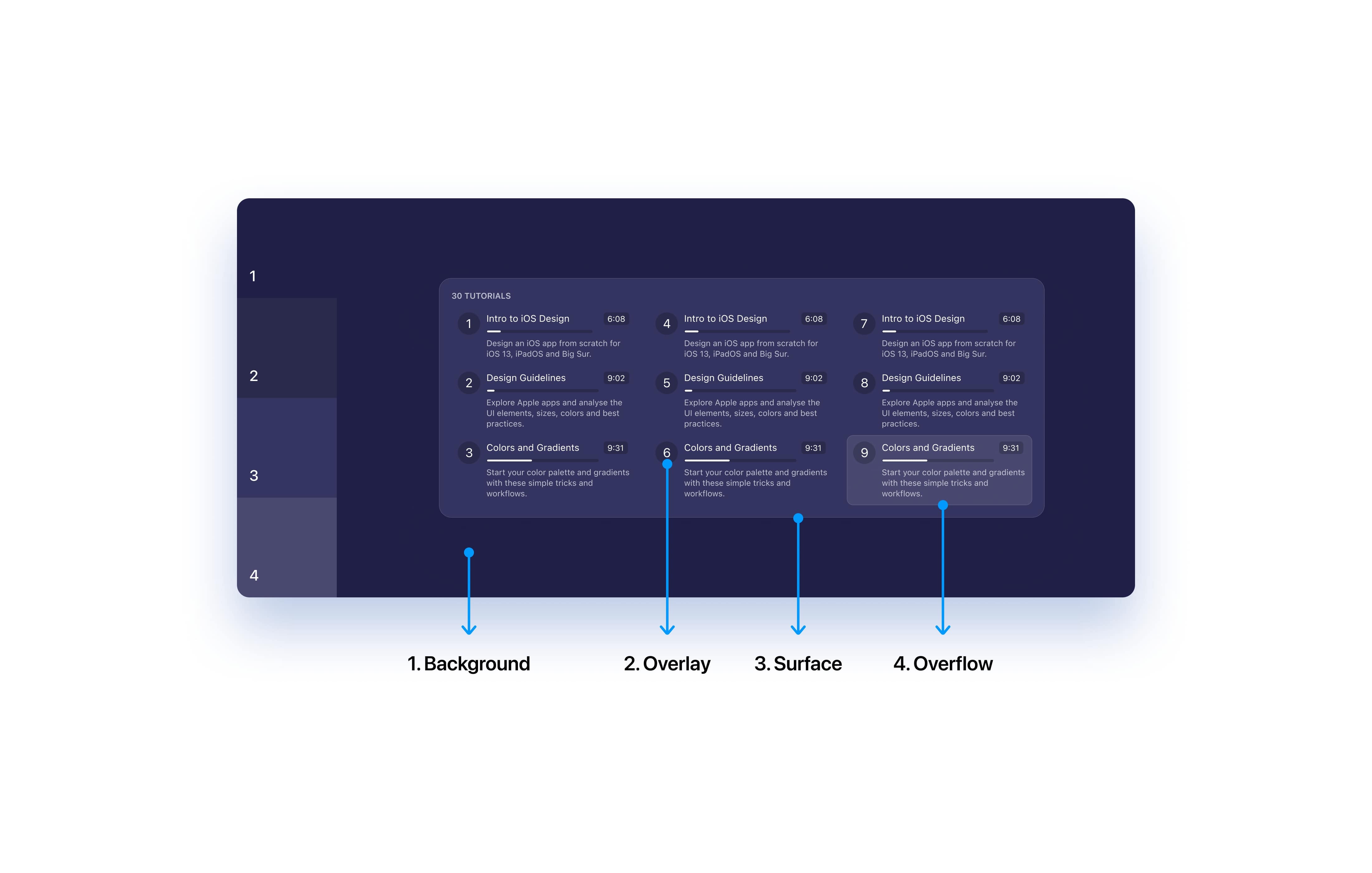
When choosing dark mode colors, use dark shades for distant elements, and light shades for closer elements as distant elements receive less light compared to the elements that appear nearer. The further the object, the darker it appears and settles more into the background.
Keeping accessibility in mind
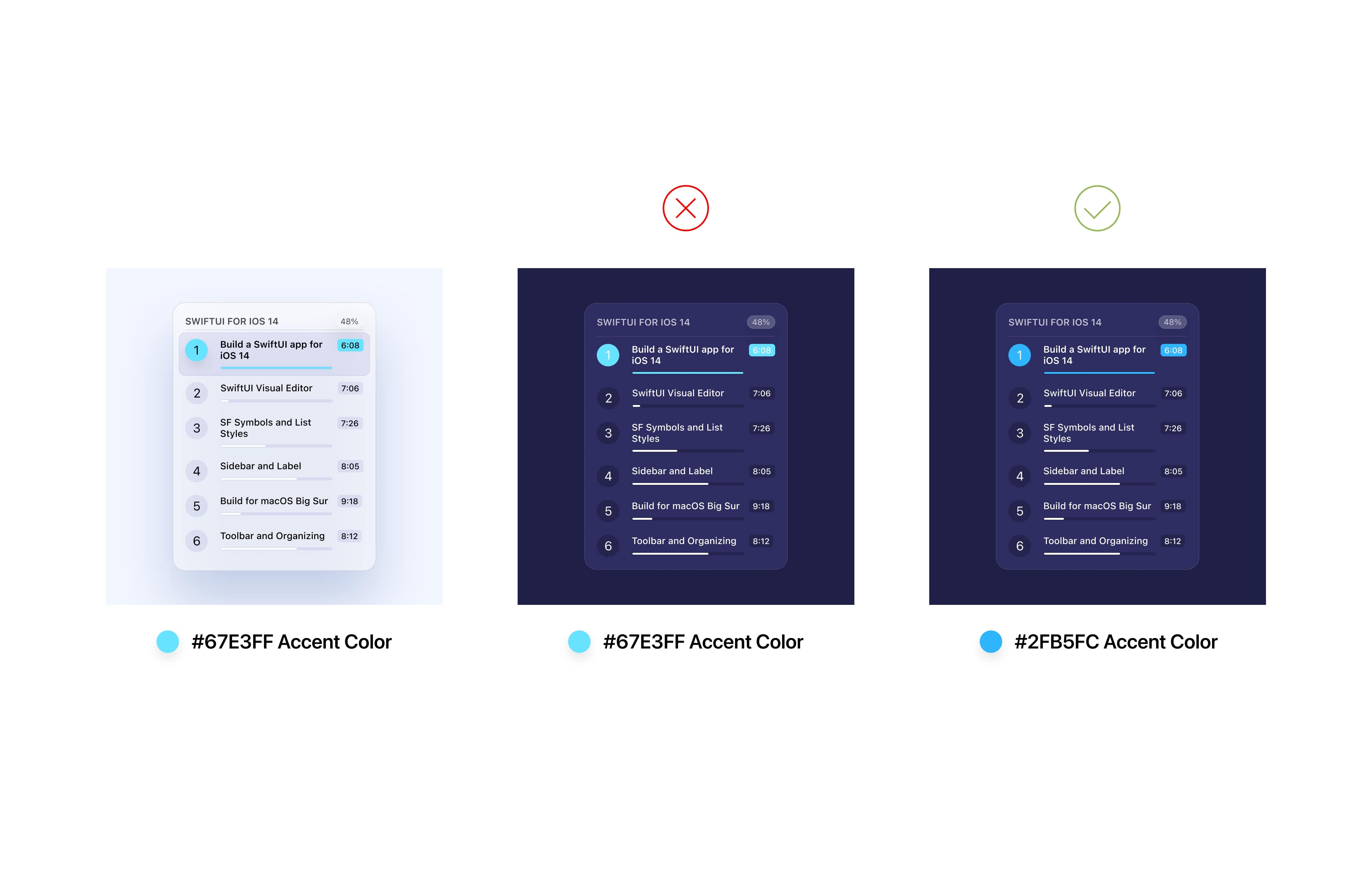
It is also important to revisit our accents as sometimes they might not be accessible. Using the same colors as in light mode may result in some parts of your app appearing too bright. This doesn't mean you have to change all the colors but adjust the HSB values for the best accessibility.
Interface
Avoid using true blacks as these restrict some ways of creating a balanced interface. For example, using shadows to create depth might not be an option anymore. You can have a tinting effect to blend the UI with the surroundings to create a harmonious interface.
Many enjoy using true blacks and it's mobile friendly too.
Contrast
It's essential that you must not give up accessibility while adapting/designing for dark mode, so always ensure a proper contrast ratio between your text and background to maintain the readability on darker backgrounds and in low light conditions.
Small Details
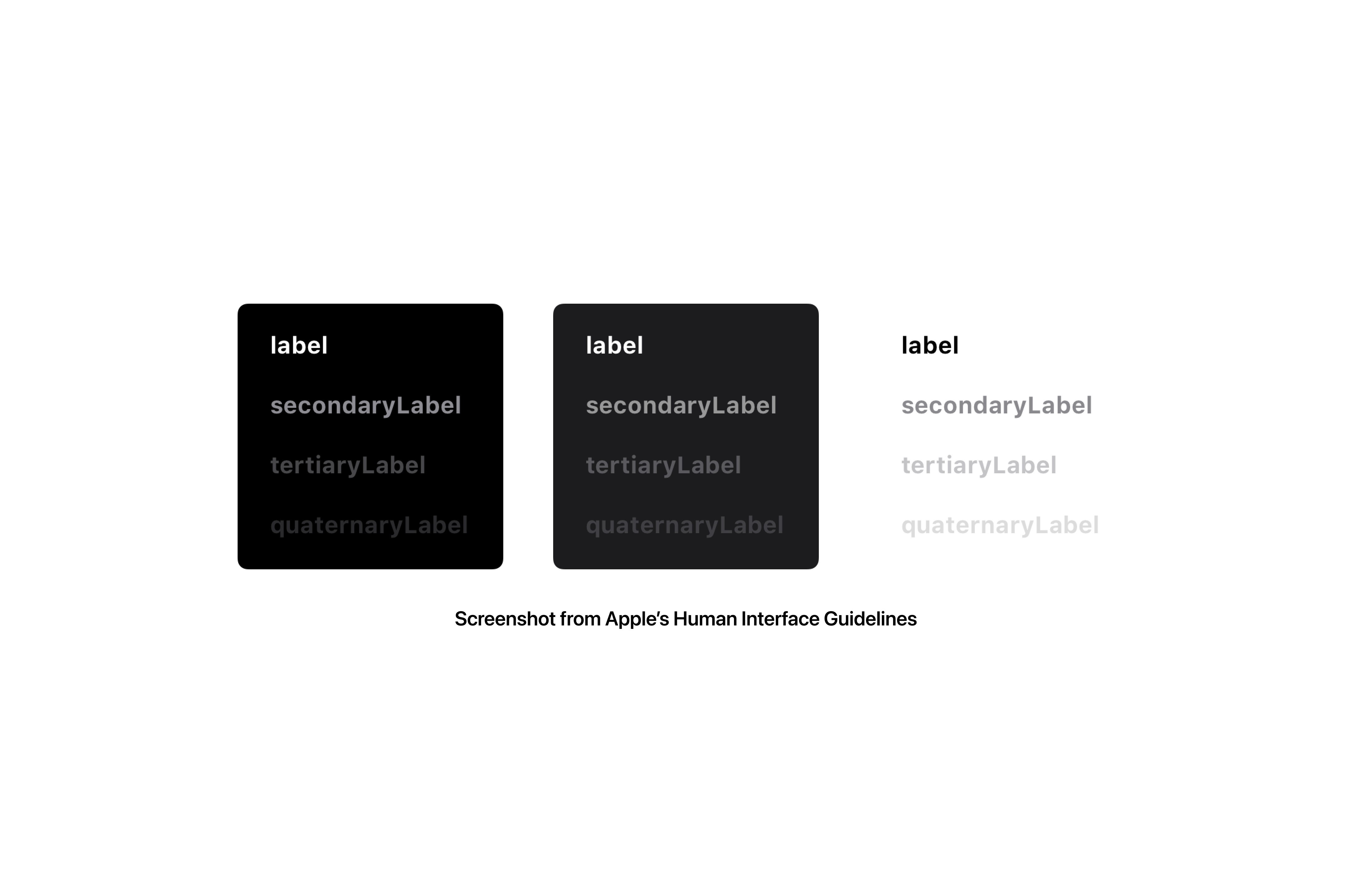
Details look and feel differently in light and dark mode. For example, an element using an inner shadow must use inner glow to preserve their appearance in dark mode. Design assets separately for light and dark mode when necessary.
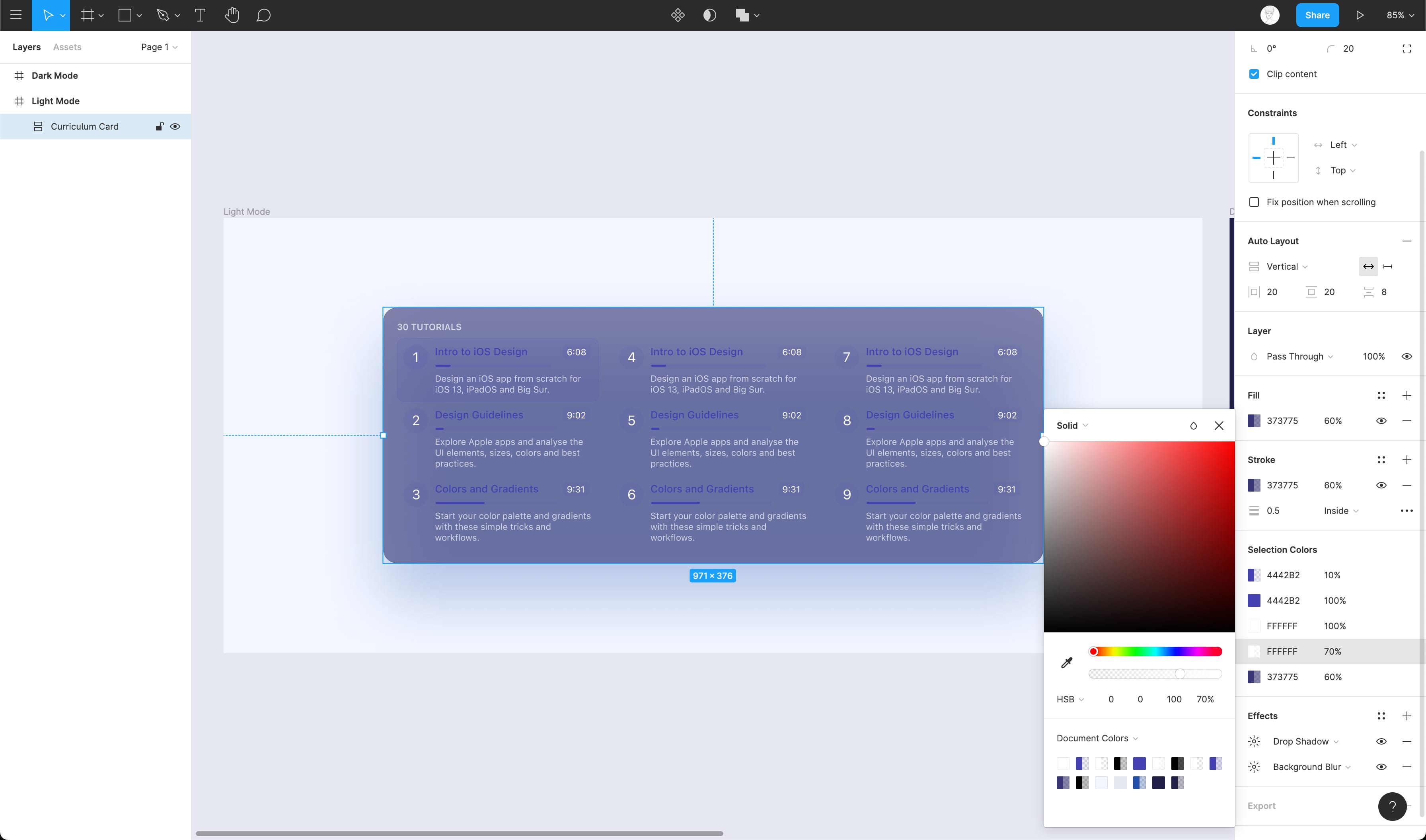
Selection Colors
Selection Colors allow you to change the look of your design without going through the trouble of selecting each layer individually and then applying the colors to the selected layer. This is very useful when you want to design multiple theme variations of your design.
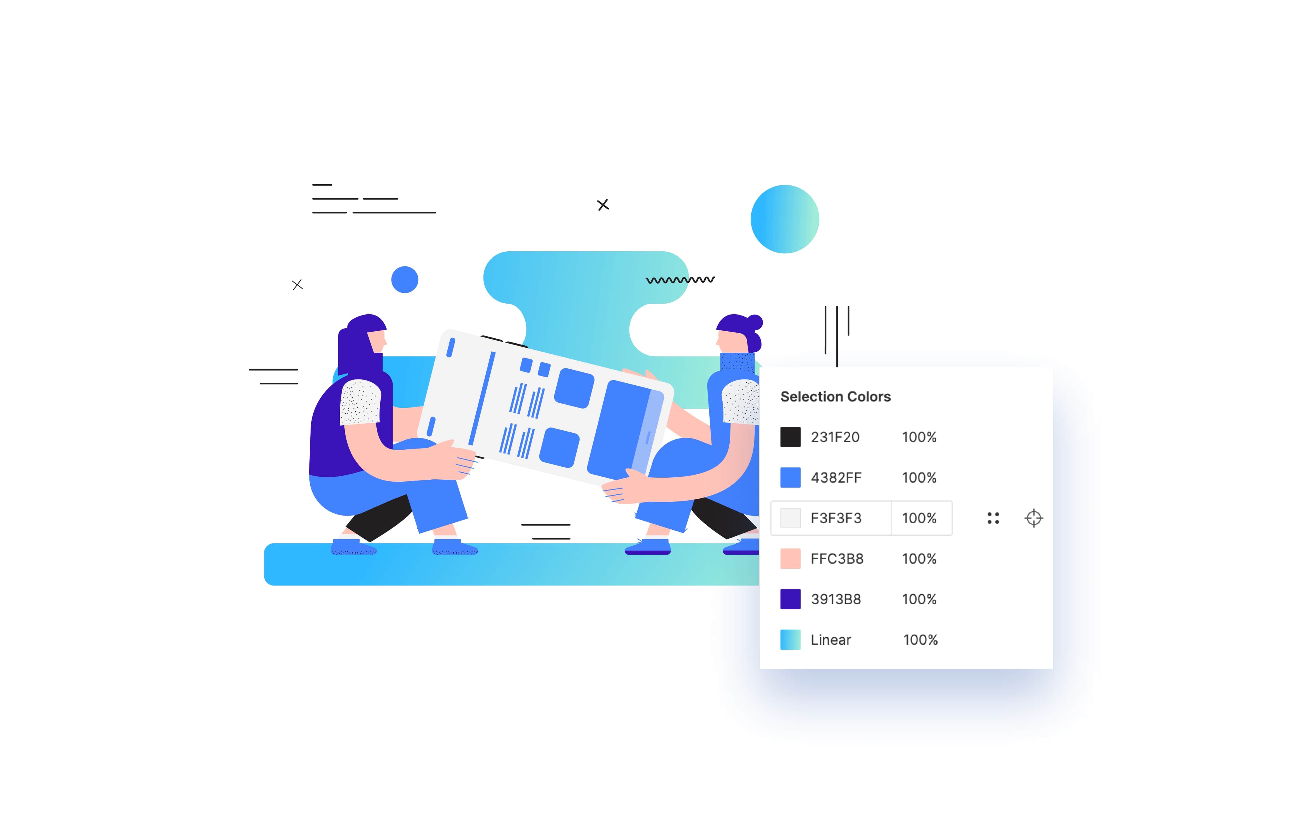
Changing Colors
As mentioned above, Selection Colors give the user the ability to change or adjust the color of elements. This can be done in two ways:
- Select an element and view or adjust individual colors in the selection
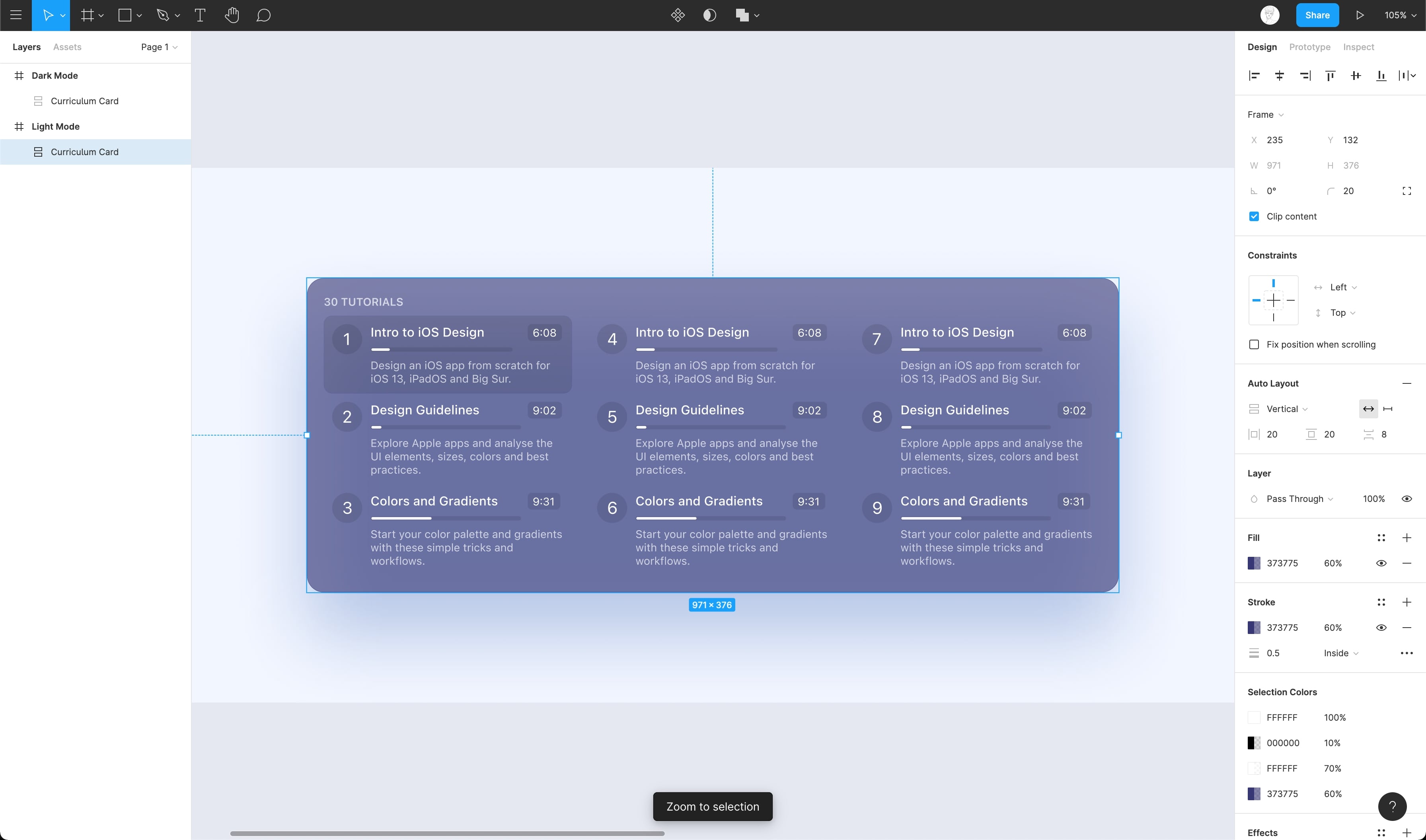
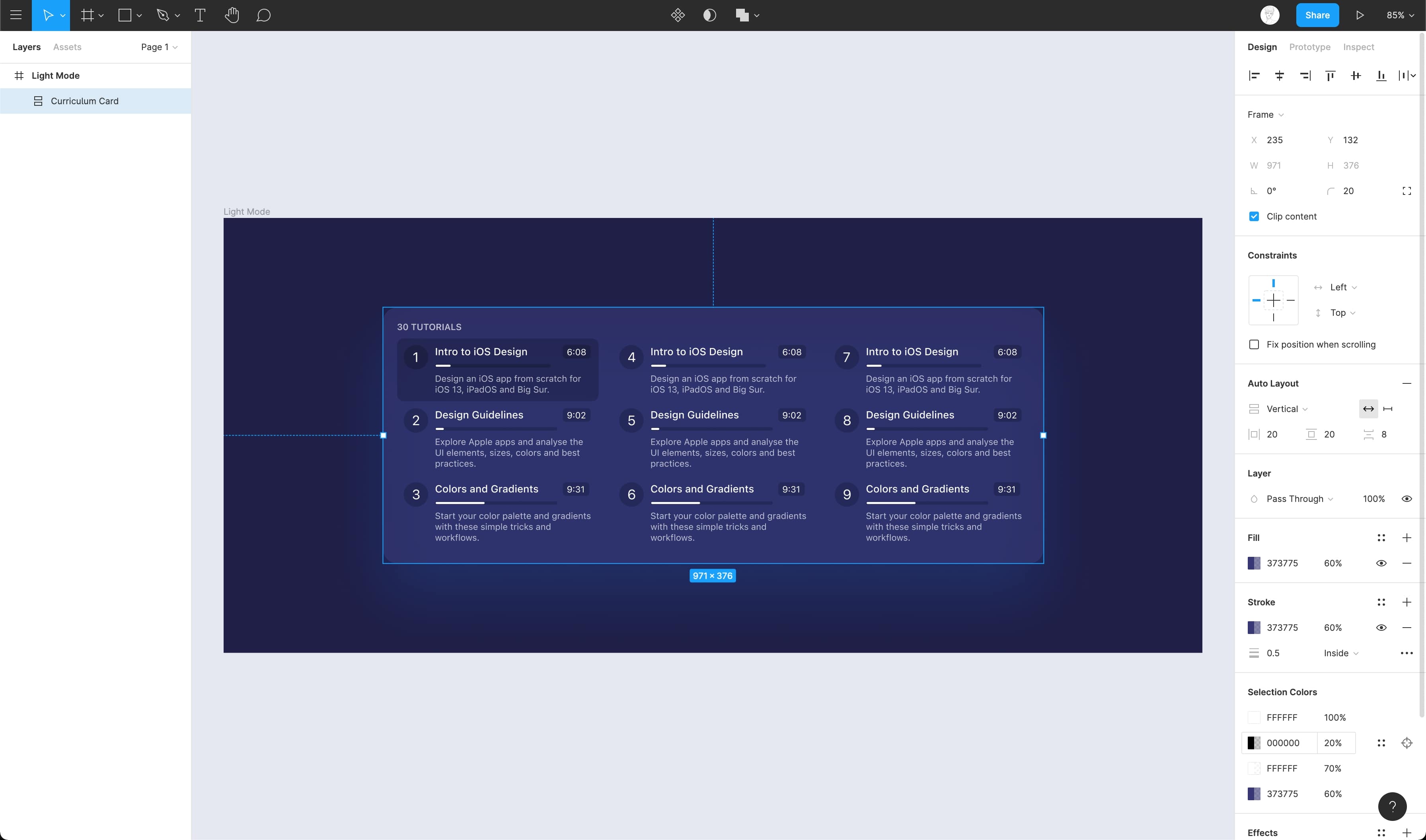
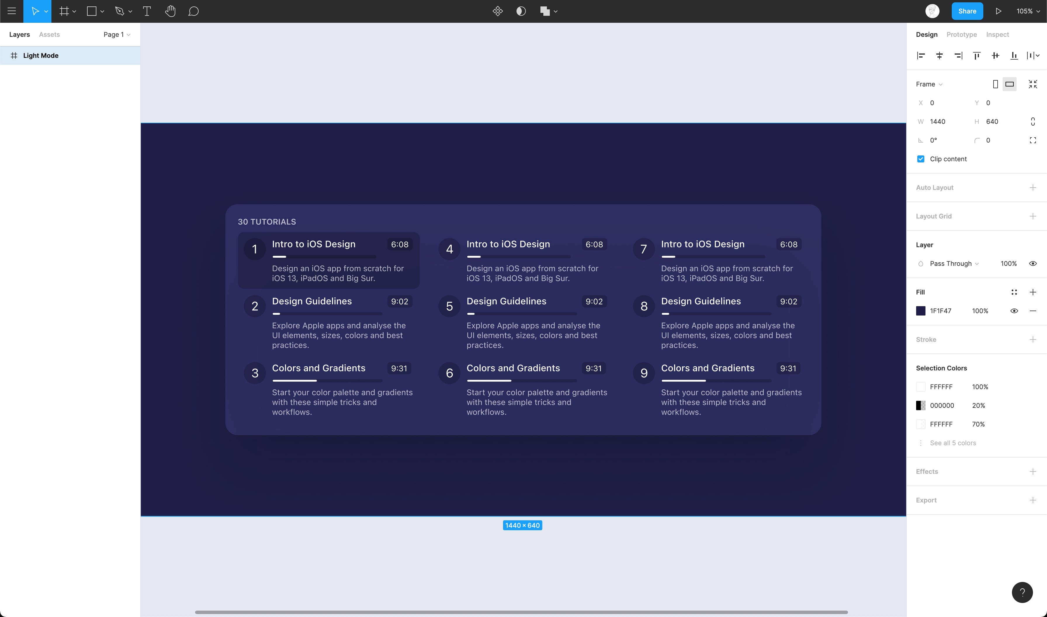
- Navigate to the Selection Colors in the Properties panel, where you can find all the colors being used in the selected element or object.
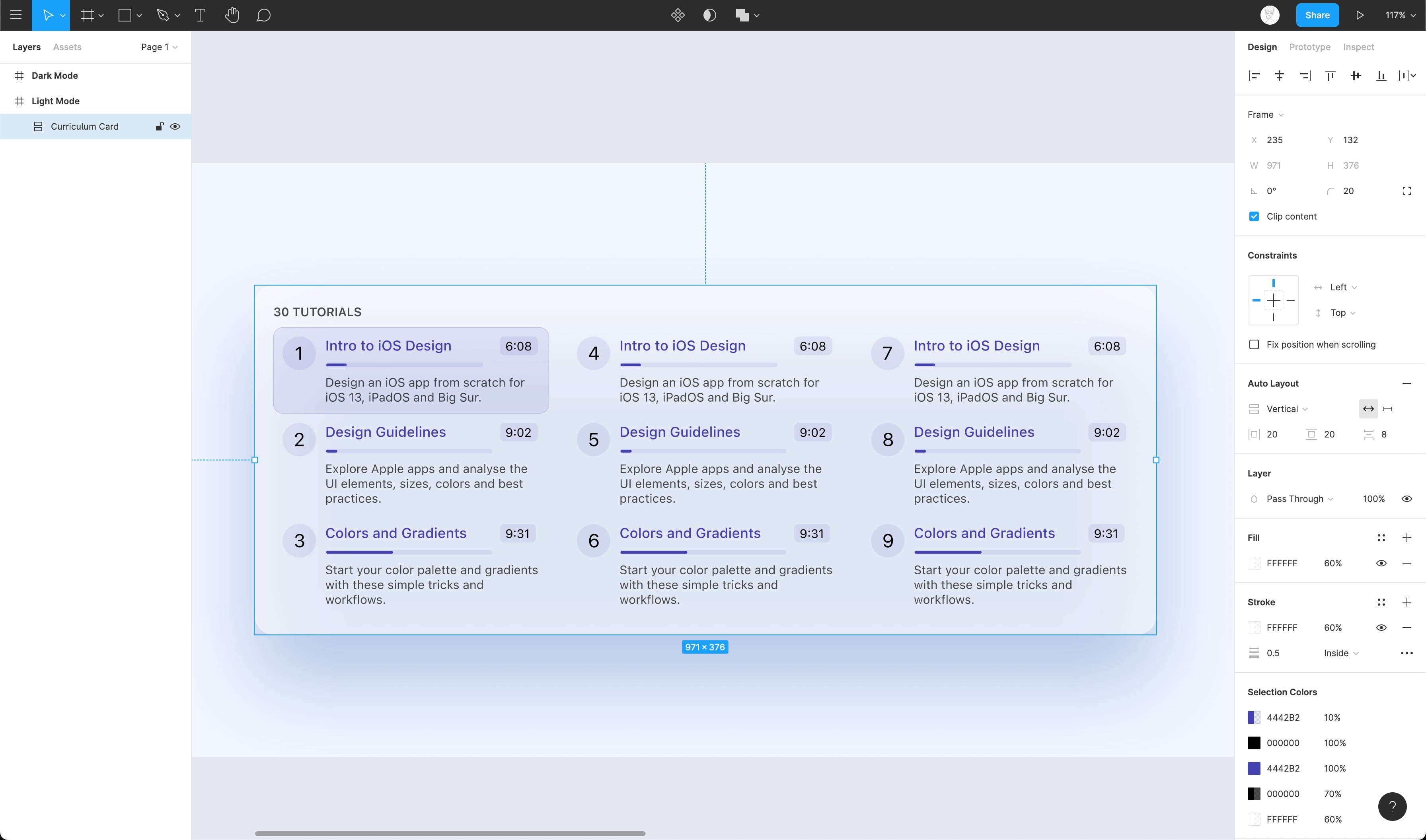
- Now let's change the base color #FFFFFF to #373775 to adpat to dark mode.
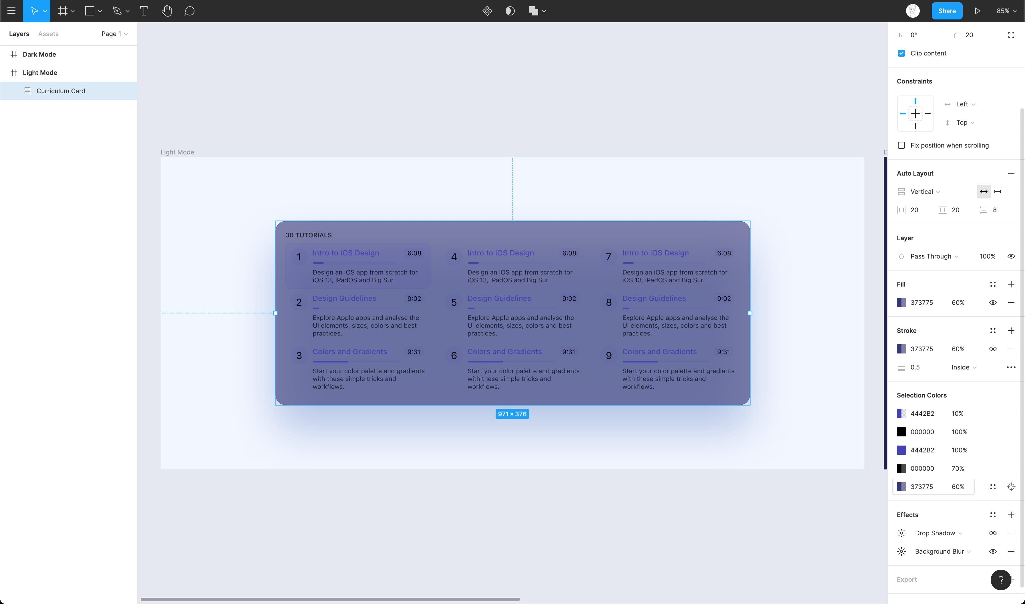
- Awesome! Now, let's change all the layers using #000000 to #FFFFFF using the same Selection Colors properties
- Change the Section titles which are using #4442B2 to #FFFFFF
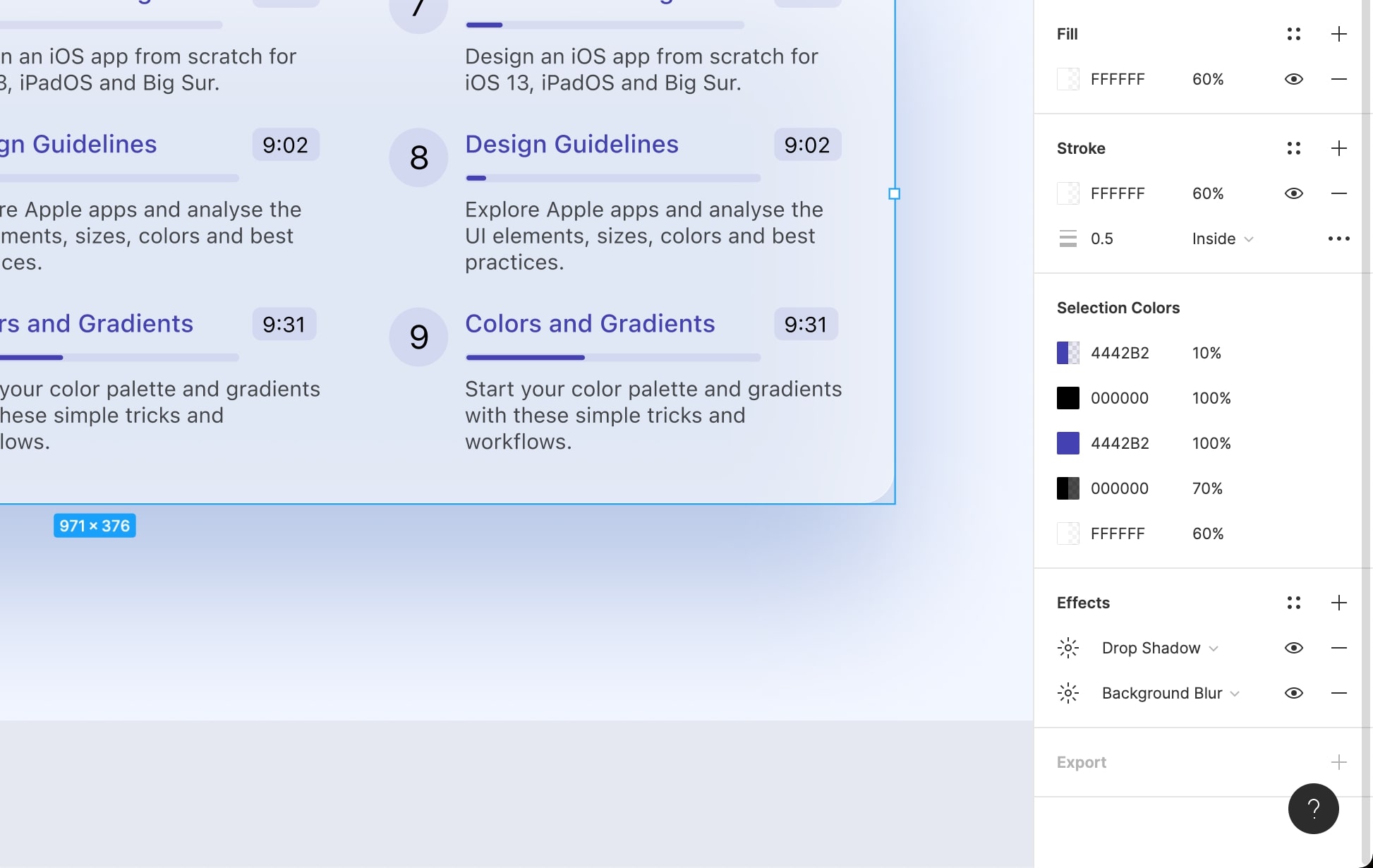
- Great, now let's change the opacity of the #000000 layers from 10% to 20% for better contrast and also set the background color to #1F1F47 from #F2F6FF
- Finally, let's set the dropshadow to #0F141E from #224FA9. This brings depth to the element!
Conclusion
Dark mode brings in lots of advantages and is now widely adopted by many users. So, it's essential to ensure that your app works well under dark mode. An important thing is to make sure that the chosen colors don't negatively affect accessibility and readability.
Original article: https://designcode.io/figma-handbook-dark-mode